Wednesday, 21 November 2018

Dragonflies

Another journaling prompt. I'm sure you can guess what it was by the post title. Its a very simple page. I used blue, (tumbled glass) violet( shaded lilac) and green( Cracked Pistachio) Distress Oxides for the background and  yellow( scattered straw)  and orange ( spiced marmalade) to go under the lamp. I used an old script stamp and crackled effect stamps to add texture to the page. I printed and cut out the lamp and dragon flies  from Kisspng and adhered them to the page with Mod Podge I printed out the quote and added some shadow with a grey Pitt pen. and the page was complete. 

I thought the lamp would be a great change from the usual flowers with dragon flies flying around them. Saying that I think I should have put the lamp on a table top instead of having it floating in the air!!

Friday, 16 November 2018

Even more Christmas cards!

 I've lost count how many cards I've made but here are a few more!
This one is a double circle welded to form a round card. This was cut out of red glitter card. I the cut out the decoration and bow from gold mirri card and adhered them tot he circle. Its finished off with a red gem. A quick and easy card.

Another quick and easy card. I cut out a row of ginger bread men a strip of glitter card and some Christmas paper from my stash. I matted the paper at the bottom of the card placed the strip of glitter card above it then the gingerbread men. I coloured their buttons and bows with markers and used a peel off for the sentiment.
The blue and silver card was created by using my GoPress and Foil machine and an Anna Griffin snowflake hot foil stamp. The card was mounted onto some silver glitter card and matted onto the blue base card. The card was finished with some clear gems.

The red card is a shaker card. I cut out the decorative baubles from gold mirri card. I also cut the outline of the baubles from the red card to form an aperture. I placed some clear acrylic sheets behind the bauble aperture and placed the gold detailed bauble on top.  I added some gold peel offs to form the ribbon and edge of the cards. I lined the back of the aperture with foam tape to create a seal for the beads. I also edged the red card with foam tape to the card would stand away from the base.   I placed some gold beads where  the centre of the apertures would be and paced the red card on top sealing the beads within the foam around the aperture. I had a ready made sentiment and adhered that to the card.

Wednesday, 14 November 2018

Stars

Another Artful Evidence challenge. This time the prompt is "Stars". I used acrylic paint to do the navy blue background and white Posca pens for the dots and stars. I also added some silver star confetti . I coloured the stars using yellow Pitt pens and left the silver confetti their natural colour. I coloured the bottom half of the page with off white/blue paint and used a swirl stencil ( home made) to add some molding paste on top of the white "cloud". I cut out the girl and adhered her tot he page and edged her in black pen. I printed out the quote and glued that to the page, edged it in yellow pen. I finished the page by coating the molding paste swirls with Wink of Stella glitter pen  to give some sparkle.

Monday, 12 November 2018

More Christmas cards

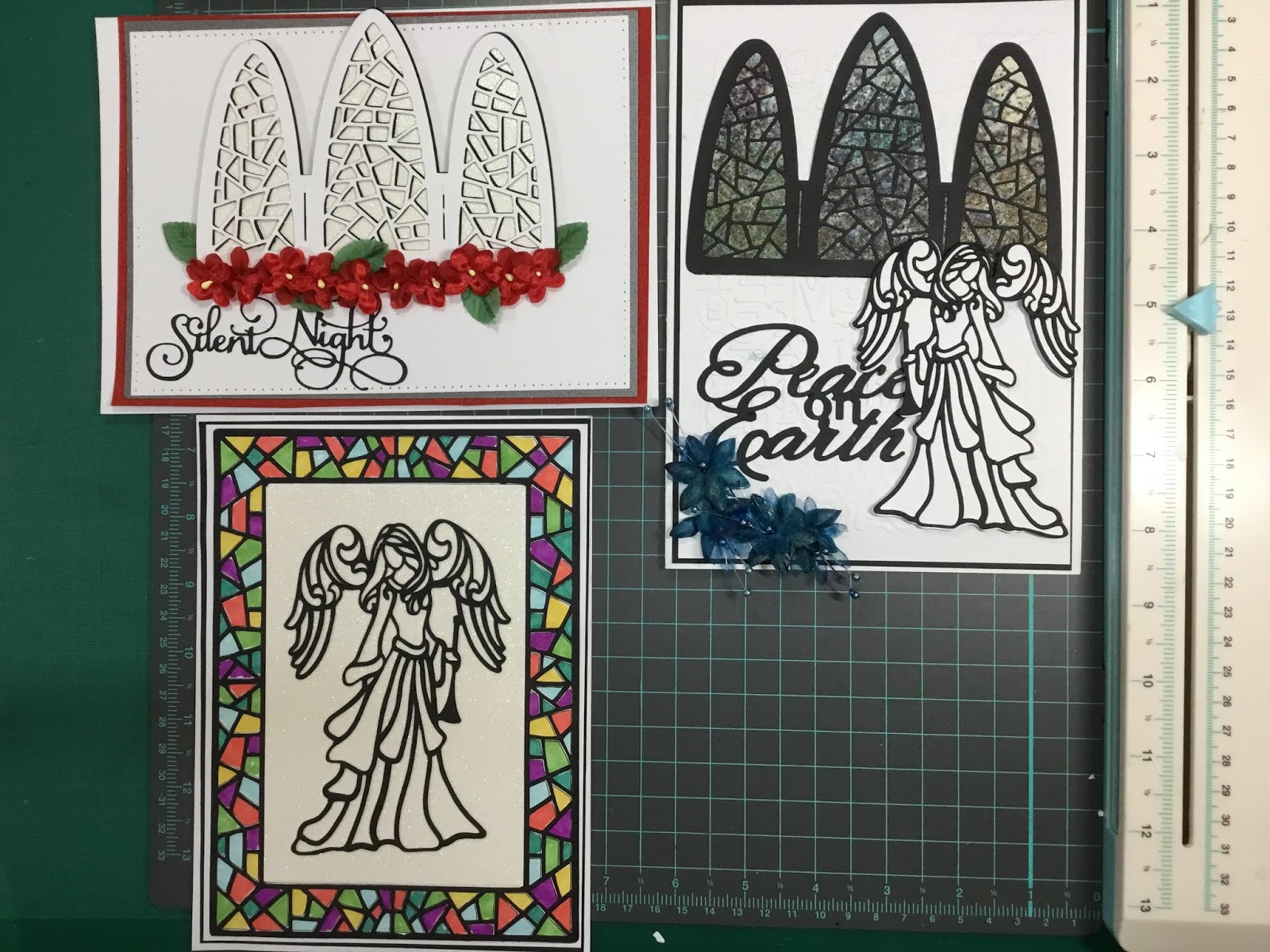
Here are some more Christmas cards I've been making recently. I have used dies by Sue Wilson, these are her triptych arch and frame and her angel dies. I confess that I have more or less copied her idea from one of her videos although I did use different cards and flowers.

The other cards were copied from a Pinterest page.
The top left card was created by cutting the Arch in white card and the underneath layer in white glitter card. I layered the two and adhered them to white linen card. this was then matted onto grey then red and adhered to the white base card. I already had some small silk flowers and leaves in my stash and used them to adhere tot he bottom of the window. I cut out the wording using my trusty Cameo and glued them to the card to finish it off.
The top right hand card window was made in the same way as the previous card except I created the under layer using Brushos paint crystals that were spritzed to give the mottled effect.  I cut out the angel in black card and the outline in white card and layered them . I adhered her tot he card that had been matted with black card onto the case card. I added some dark blue silk flowers in the bottom corner. As with the other card I cut out the wording and added it to finish the card.

The bottom card again used Sue Wilson dies I cut out the angel and frame from black card. I used the frame as a template to trace the shapes onto the base card. I coloured the shapes using Kuretake water colour brush pens. When dry I placed the black frame over the shapes to give a stain glass window effect. I inserted white glitter card into the centre of the frame and added the angel. I think this one is my favourite so far!

Sunday, 4 November 2018

Diamonds

As you can see I'm really getting back into mixed media journalling. This week's challenge is "Diamonds".
The background was created using cream acrylic paint, Brusho Paint crystals, a diamond stencil, rub-ons and Stampin Up blue ink.

I used cream acrylic paint as a base colour. I sprinkled a variety of the Brusho  crystals over the left hand side of the page and spritzed with water. When it was dry I used a stencil, which was a piece of plastic from home, and daubed the blue ink over it to create the diamond pattern on the top right and bottom left of the page.

I used a stamp to give a cracked effect and finished the background with a few bits of rub-on from my stash.

I cut out the butterflies from white card and purple Mirri card  and adhered them to the page using matt medium.

I love the effect that Brushos make. It is a very versatile medium. Thats it for this challenge.


Christmas cards ( Free cutting file.)

It's that time of year again when crafters are busy making  Christmas cards to send to friends and family. I like to vary the design  of the cards so I don't get bored of making them. I tend to make up to 4 of each design, at most, I mainly only make about two though.


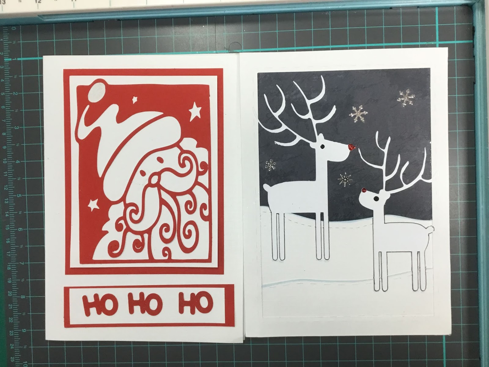
I got the idea, for the two cards on the left,  from Pinterest. I  a some reindeer clipart and created the card  on my Cameo and adhered them to black card. You can download the file HERE.

The Santa square is a file I downloaded last year from the Silhouette design store (design ID 14733). I layered the card on white and red card and added the HO HO HO.


The snowmen cards are my design. I cut out a circle from the centre of some red card. I a white gel pen to add dashed lines around the edge of the card and circle to add some interest. Next I used my Hero Arts snowmen stamps to stamp, colour and cut out the snow men and hats. They were adhered to the back of the red card. I then adhered the red card to the base using foam pads. I had some clear gems and snowflake stickers that I stuck to the card as well  The lettering was made using my Cameo. I don't know what I would do if I didn't have my Cameo its so useful.

The dark blue card was me experimenting with a Christmas tree die and my GoPress and Foil foiling machine. I laid the die on the machine, layered foil on top and heated it up so the foil adhered to the card. I added some gems and a glitter star. The topper was matted onto silver Mirri card and back onto the navy base card.

The white card was done using a Chloe tree stamp. I stamped with Versamark and heat embossed it with silver embossing powder. I cut the shape into triangle and matted onto silver Mirri card and then onto the white base card.


I do like the variety of methods used because I find it challenging when I try something for the first time.


I've got a few more cards to make so keep watching.....

Wednesday, 31 October 2018

Halloween. ( Cutting file)

Yet another Artful Evidence challenge, this time a topical one as its Halloween week.
It didn't turn out anything like I intended but I liked the way it developed as I went along. Originally I was going to do a witch's cauldron with poison and weird  "ingredients" around it.
I used purple Dylusions spray ink to cover the page. I then used orange and yellow to colour a separate paper that I ripped into a rough square shape. However, once I'd adhered it to the page I thought the layout looked too much like the  Autumn theme page.

As the top layer was orange I decided to turn it into a pumpkin instead so drew and shaded some lines using brown Pitt pens.  In order to disguise the squarish shape of the pumpkin I printed and cut out some pumpkin leaves and adhered them around the page.

I soon realised I didn't have enough room in the centre of the page to add a cauldron and other elements so I had to put my thinking cap back on. I decided to make the pumpkin a bit spooky so drew in the eyes using Pitt pens.

I cut out the rook and adhered it to the page so it would be looking at the eyes. I added some white pen to highlight the bird.
I added some shadows, cobwebs and wrote the lettering.
I'm quite pleased with it even though it is totally different to my original idea. That's the beauty of a  page evolving as you go along.

If you would like the rook cutting file you can download it HERE

Sunday, 28 October 2018

Steampunk


I was delighted to have won the Autnumn challenge and had my page used as the groups  cover page for that week. 
This is my offering for the artful evidence challenge. It's not your typical steampunk but I like it.
I painted the background with acrylic paints and a dotted stencil by Tim Holtz. I stamped some images on the background using Stazon and Dyan Reavely and Chronology stamps. I mixed yellow paint with some texture paste and spread the paste on the bottom of the page. It gives the page some texture. 
I used a Tim Holtz stencil to add some "bubbles" using white paint.
 Next I cut the border and cogs   from grey cardstock  I adhered these onto the page with some matte medium. I added some split pins then printed out and cut the other elements and glued them to the page using.

Finally I doodled over parts of the page with metallic and coloured Pitt pens.
I've started making Christmas cards so I'll be posting photos of them shortly!

Wednesday, 17 October 2018

Autumn


I have recently made a birthday card for my Grandson's birthday but forgot to make a picture of it so there's no point in describing how I did it.  

 Instead I wil show you my latest mixed media journal.This is my submission to the Artful Evidence challenge. I coloured the under page using a few Distress Oxides then I used some old flower stamps  with Stazon brown, red and green inks. The next layer was also colours with Stazon inks but slightly lighter colours and stamps. I ripped the edges of this layer to give the page more dimension and interest. I used walnut stain for the edges so the page would stand out.  I then adhered that layer to the page.


While the glue was drying I printed and cut the chestnut leaf and squirrel using my Cameo. I embossed the leaf with a crackled effect embossing folder and rubbed over some distress oxide to create veins. The leaf was then adhered to the page in a way that was uneven making it look as if the leaf was not flat in places.
I adhered the squirrel and then added colour and fur effects  using my Pitt Pens.
I tore some pages, with the meaning of Autumn and Fall, from an old dictionary and adhered them to the page. I used peeled paint Distress inks to colour the pieces and edged with a black pen. 
That is my page finished!


O

Monday, 1 October 2018

Sunset

This page is an artful evidence  challenge. This is a page I have done before but is one that was ruined by water damage in my old journal.

I downloaded the curls background from Shutterstock, the palm trees from Freepik and the sun hat from Kisspng. I already had the drink and bag but can't remember from where I got them.

Many years ago a friend gave me a load of paper from which  teabags are made. It's consistency is like a very strong tissue paper. I cut it into an A4 size and adhered it to a lightly glued piece of copy paper and printed out the curly design on to it. I removed the copy paper and adhered the printed teabag paper onto my journal page with Mod Podge.

Once it was dry I painted the sun, sky, sea and sand with Dylusions paints, blue, orange, yellow and purpleI touched the page up with my Posca pen (white) and Pitt Pens to give a feel of waves and tone down the sand.

While the background was drying I turned my attention to the elements. I used my Cameo and Silhouette software to trace and cut out the trees, bag, hat and glass. I continued to use Mod Podge to adhere the elements to the page. I then added some edging, highlights and shadow to the objects with my pens. I printed off my sentiment and finished off the page by adding it and colouring it to blend in with the picture.
I'm really enjoying the challenges, its getting me back into mixed media journalling.

I have started another non challenge page but it's not finished yet. Thats for a future post so keep watching!

Wednesday, 26 September 2018

Doors

This page is not a challenge but an inspiration from a quote I saw online. The quote said " Old ways don't open new doors". It coincided with me finding some cut up doors in my ephemera box.
I covered the page with grey brick patterned paper using Mod Podge. Next I used two stencils, one brick and one dots, and modelling paste to add texture.  Once dry I used green and orange Pebeo ink to create drip effects. I widened the effect by spritzing with water as the drips fell down the page. This gave a more overall coverage of colour which I like.

Next I turned my attention to the doors. I wanted them suspended  on the walls.
They were already cut out so I simply backed them with scraps of paper from my stash and ahered them tot he page using matte medium. One door I adhered it so it would open. Inside that door I wrote out the quote. I decorated the doors with handles and knockers using sequins. I created shadows with grey and green Pitt pens.

Tuesday, 25 September 2018

Speak up.

I used to be a very shy person who wouldn't say Boo to a goose but as I've got older I've learned to speak up for myself so I decided to create an journal page to show that.
I sprayed the page with Dylusions sprays in yellow, purple, green and red then spritzed with water. I then dabbed the page with a paper towel.

I downloaded the image of the face from kisspng and cut it out using my Cameo to create a  stencil. I drew around the stencil and coloured the shape with a black Pasca pen. I coloured her lips in red.
I cut out the quote from red card and edged them with a thin black pen. Simple but effective.... well I think so anyway! LOL

Monday, 24 September 2018

Books

This page is another one inspired by the prompt from Artful Evidence challenge.

A quick easy page.
I took two pages from an old book and adhered them to the page. I lightly coated the page with gesso to fade the text slightly.

I obtained the  centre focus from "get drawings" website I cut it out  using my cameo and black card. I then adhered it to the page. I also cut out the text (Jedi) from the same black card. I added some shadow with a grey Pitt pen and lines using a fine black Posca pen. I edged the page with black soot Distress Ink and the page was finished.

Numbers challenge

I've joined a Facebook Group called "artful evidence" run by a very talented lady called Rachel Black. She also uses Youtube under the name of Rach013.
Rachel runs challenges for art journaling. She gives a prompt and people have to submit their interpretation of their page from that prompt. The beauty of this is  how wide  and creative people are!
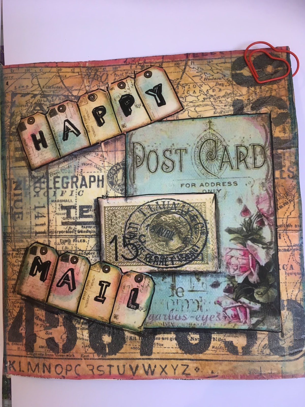
My last post showed my submission for the prompt "quotes". I'm trying to catch up on some past prompts so this one is the prompt "numbers".
I used Tim Holtz tissue paper to create the background pattern including the numbers. I coloured the background using Distress Oxides antique lined, worn lipstick and blue. I used the pink and blue on the tags as well.
I found the post card and stamp print in my box of ephemera so I'm unable to say where it originally came from. I printed of the tags from a Pinterest page and stamped happy mail using Stazon.
I adhered all the elements onto the age with Mod Podge and edged the elements with black pen.


Sunday, 16 September 2018

Define Yourself

I'm slowly familiarising myself with mixed media techniques as I get back into journaling.
For this page I used various colours by Dylusions sprays and Cosmic Shimmer. I did try a stencil with text but it was not very successful so I sprayed over it, which gave a more muted set of colours. I liked this effect because it meant the girl standing alone gave a more prominent  focus point.

I used a script stamp with white and black ink to add depth to the background.
Next I used rub ons to give more layers I also added a few scribbles as well.

The ladies are angel stamps by Chloe that I coloured using my Touch alcohol markers and Posca pens and rub ons.
Once I adhered the ladies to the page using matt medium gel ( Golden) I splattered the page with white acrylic paint. I printed, sprayed it with more dylusions ink and cut out the quote and adhered the words to the page. I  added dots around the edge of the words and page with black and white Posca pens.

I finally sprayed the whole page with gold cosmic shimmer which as given it a lovely shiny sheen. This doesn't show up on the photo.


Thursday, 13 September 2018

Friends mixed media Journal


I recently bought  Dyan Reavley  border colouring sheet book and one of the pages had these legs with shoes on it. I just loved this page so decided to use them in my journal.
I painted the background with orange and green Dylusions paints. I sponged the green section of the  page and splattered the orange with yellow paint to give different effects. I used my new Touch marker pans to colour the legs and shoes. I then adhered the leas to the page using matt medium gel.

I found this lovely multicoloured strip of material in my stash cut a strip and adhered to to the middle section of the page using Mod Podge. I also used Mod Podge to cut the two thin strips of plain black card to separate the sections. I added red and orange dots to the strips to give them more interest. Finally I printed off the quote using Rainbow font, cut the words into strips and adhered them onto the page edging them with a black pen.
Page complete. I seem to be getting my mojo back as I have a couple of ideas for some other pages.......... what will they be?

Wednesday, 12 September 2018

Peacocks mixed media journal

I saw this quote and couldn't resist doing a journal page for it. "One day you're a peacock the next you're a feather duster!" I have joined a Facebook group called Artful Evidence and this is perfect for one of their challenges.

I covered the page with gesso and then painted the edge with black acrylic paint. Once dry I downloaded the background paper  from Pinterest and uploaded it to my Studio software. There I inserted the text and dragged it so it would fit around the edge of the paper and then printed it all.  I used Faber Castell brush pens to colour the feathers in the background.

Next I printed the peacock from kisspng website. I fussy cut around it and adhered that on top of the page. I used my Posca pens to draw around the out line of the peacock and added squiggles here and there to finish it off.
Page 3 complete!
I wonder what I'll do for the next page? keep watching to find out!

Saturday, 1 September 2018

Journal Page 2 - Relationships

I've bought a Dylusions border sheets book and the houses were just crying out to be used. The quote is a repeat of one  I previously used in the journal book that had been ruined by the water leak.

First I sprayed the page with Dyan Reavley's Dylusions ink spray in blue, green and orange. I then stamped the page with a script  and crackle stamps and Stazon ink.  I placed a hime made script stencil over the page and sprayed it with gold cosmic shimmer. It gave a nice subtle sheen to the page which is not clear on the photo.

  I remembered I'd bought some Brusho crystal colours and this was a great opportunity to use them. I sprinkled the crystals over the page and spritzed with water to activate the crystals. I used red, orange and blue crystals .

While all that was drying I used my Promarkers to colour in the houses. I scanned the border into my computer and reversed the image before printing it out so the "street" was not totally identical on both side prior to cutting out and colouring the houses. I also printed and cut out the arrow and quote.

There is something quite therapeutic and calming about colouring in isn't there?
Once everything was completed and dry I just adhered them on to the page using Golden matte medium. 
Finally I splattered some drops on to the page using acrylic paint.  Page completed!

Thursday, 30 August 2018

Page 1 new art journal.

 A new journal and a new page -- new beginnings deserves a quote.
This is  a simple page, I painted  the background with yellow and white acrylic paint. I stamped circles from two long stamps in my stash. Ive had them years and can't remember from where they came. I used "Stampin Up" inks Pumpkin Pie and Bermuda Bay.

Next I drew circles, of various sizes, going diagonally across the page from top to bottom.
Next I used Gelatos, Posca paint pens and Pitt artist pens to colour and decorate the circles in various colours and create a shadow around the circles. Not all the colours gave as even a coating of colour as I wanted and the more I fiddled with it the messier it started to become. The art of colouring is knowing when to stop messing with it and making things worse!

I edged the page with two squiggly lines and printed out the quote cut it into strips and adhered them to the page using Mod Podge. I coloured and edged the strips. The quote is one I found on the internet and I liked the link to beginnings and me started a new journal.

 That completed my 1st page. Its pretty simple but thats fine to get me back into journaling.

Monday, 27 August 2018

Mixed Media Journal Part 2

Having completed the inside pages of my journal I am now going to make the cover using a material I discovered  a few months ago at  a workshop at my local crafting crop. We used this material to make a cover for a note book. I showed this in a previous post.

The material was washable wallpaper lining that looked and felt like soft leather once we had processed it. Its a waterproof paper that doesn't rip and is pretty tough. Decorators use it to cover cracked walls. The brand we used was called "Wall Doctor". It gives a strong but flexible finish which is ideal for this type of journal.

I measured my book and cut a piece of paper that was twice the height of my book because I intend to use a double thickness of paper for the cover to give the cover extra  strength.   I then scrunched the smooth paper up and kept scrunching until the paper was completely soft and crinkled. The photo shows the difference from start to finish. The smooth paper is on the right of the photo.

Once I had it soft I washed the paper in cold water containing a little washing up liquid, then rinsed it throughly. Washing the paper doesn't alter the strength. I let is dry slightly but not completely. The dampness helps the paint/ ink to blend well into the paper.

You can use a variety of medium to colour the paper from inks to acrylic paints, sprayed or painted on.
I used Dyan Reavely's Dylusions paints. I used  red, purple, blue and yellow to decorate my sheet. I simply sponged, rubbed and dabbed  the colours onto the sheet using a normal cut up sponge.  The dots in this picture are from my own fingers that got pretty messy so I decided to use them!

Once I was happy with my design I left it to air dry. If the paper is very wet the colours can blend more and even become paler so be aware that  the dry sheet might not turn out exactly how you expect.

  I then folded the paper in half and stuck both layers with strong ( Gorilla) glue and left it to dry. I burnished the sheet well by using an old loyalty card and bone folder to make sure the halves stuck well. Once dry I trimmed the cover to fit the pages.


  I stamped the cover to add more detail using Stazon inks and various stamps I have in my stash. I used the midi Stazon colours but they tended to look black whatever colour I used. I think it was something to do with the background colours and the material being used.


Given the cover will receive a lot of use being opened and closed frequently I strengthened the edges  further by stitching them with my sewing machine.


Finally I stitched the cover to the book in the same way as I stitched the insertions together. This time I started stitching from the outside inward so that there would be excess thread left on the outside. I did this so that I can use it to thread bead or elements onto the threads in order to decorate the book once I have filled it up.  I won't do this before hand because the pages won't lie flat if there are beads etc are there getting in the way. I also intend to decorate the cover in some way too.


It also  created some decorative element to the cover. I simply used  yellow cotton to match the ribbon and zig-g stitches.  I added the yellow ribbon to create a closure for the book. I left plenty of excess ribbon so the book would still close as the pages thicken when elements are added.


I could just as easily have left the insertions loose and sewn the pages and cover together at the same time but I figured the double set of stitches would make the book stronger. In the past I have also have added smaller insertions interspersed between a few pages to add further interest and challenges to my journal project.

Next time I make this journal I might make two sets of insertions inside the cover to make a 24 page book. I don't want too many pages because a thick  journal can become very bulky and difficult to work on after a while.

Now its time to start using the journal!